Food Insecurity Among Residents of Seattle-Bellevue-Tacoma During the Covid-19 Pandemic Role
Role· Researcher, Data Visualization Coordinator
Tools· Google Data Studio
TeamRedeite Moges, Homa Moosavi, Jayna Wang
Duties· Research, Design, User Interview, Usability Test, Low and High Fidelity Wireframe, Prototype, Persona
Context· Class Project
Ethical Considerations
There were a few ethical issues to consider during this project. Since we're looking at a sensitive issue that affects vulnerable people, I think it's crucial to be aware of these ethical concerns. Here are the ethical concerns that my teammates and I identified as the most prominent.
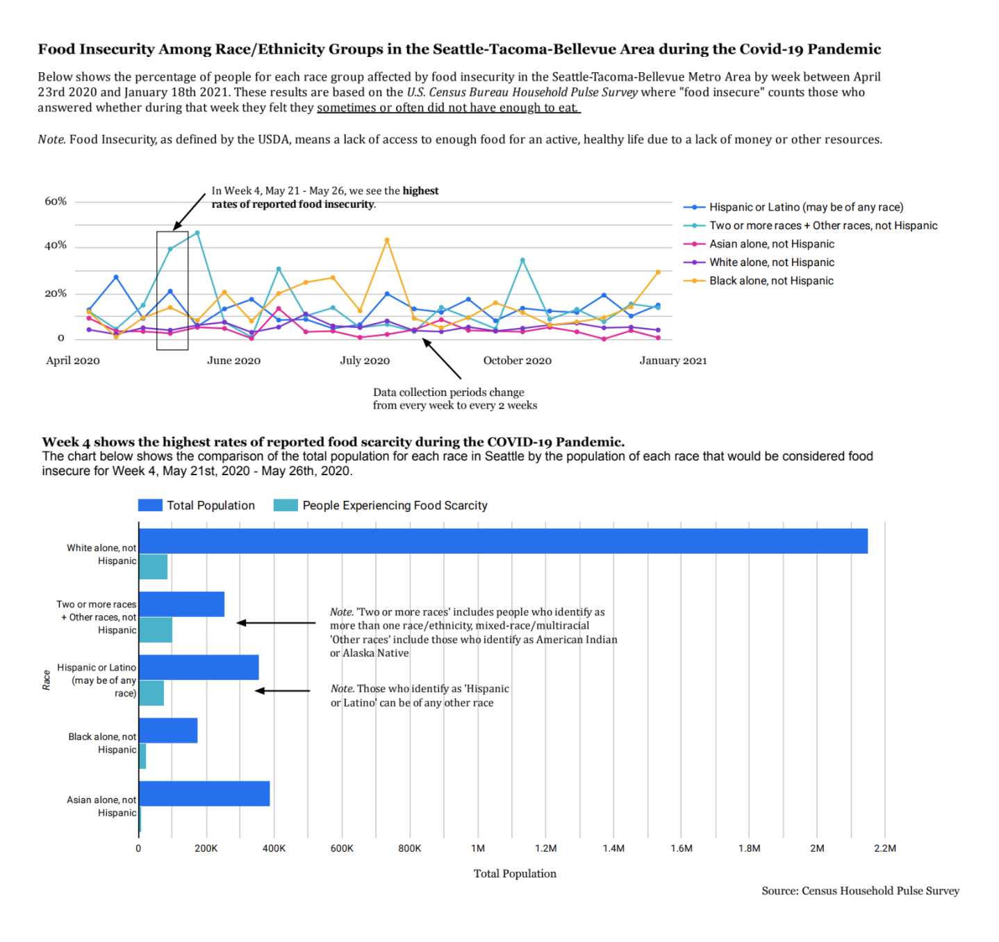
We are examining vulnerable populations in this visualization. Food scarcity and food insecurity are serious problems that are affecting real people in our community. We want to remain conscious that this visualization symbolizes the food insecure population of the greater Seattle area, and therefore represents a lot of suffering. Furthermore, our dataset did not include Native American populations as an ethnic group, which limits our understanding of how food insecurity impacts our community. We acknowledge that this dataset represents households on the ancestral Duwamish territories, and they deserve to be represented as well. It is not our intention to ignore Indigenous suffering caused by food insecurity and systemic ignorance. This visualization can therefore be anxiety inducing to certain populations. Our intention is to accurately represent food insecure populations in the Seattle area without judgement. Audience members who belong to non-white ethnic groups may feel distress when seeing their racial group being disproportionately impacted by the Covid-19 pandemic. The users we selected for user testing did not experience food insecurity for the duration of the pandemic and are appropriately biased. We are using color to clearly differentiate between different ethnic populations. We tried to pick colors that are distinct enough for color blind people to be able to distinguish between the ethnic groups.


